Architecture
ECharts (Enterprise Charts)
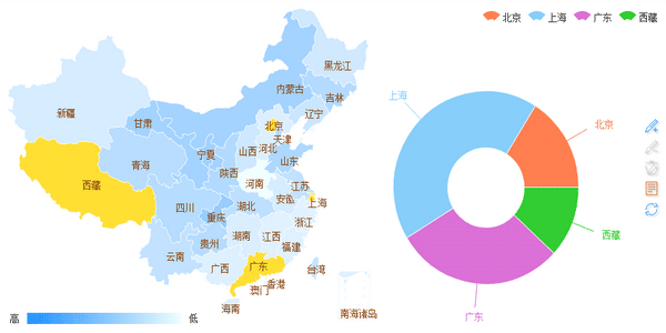
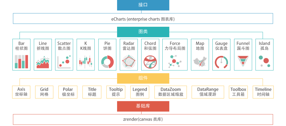
ECharts is a comprehensive charting library offering a painless way of adding interactive charts to your commercial products. On the foundation of ZRender-based (a whole new lightweight canvas library) coordinate system, legend, tooltip, toolbox and other basic components, ECharts currently supports line, column, scatter, pie, radar, candlestick, chord, gauge, funnel, map and force-directed chart types, many of these can be combined in one chart.


(IE8- powered by excanvas )
-- Open source from the team of Baidu business front-end data visualization
Baidu Hi : 1379172 | echarts(a)baidu.com
Features
You are cordially invited to view the document "Why ECharts?" online, which covers all the chart types and major features of ECharts.
*Since some features of the document don't work with IE8-, you are specifically recommended to read the document in IE9+, Chrome, Firefox, Safari, Opera or other modern browsers.
Combinations
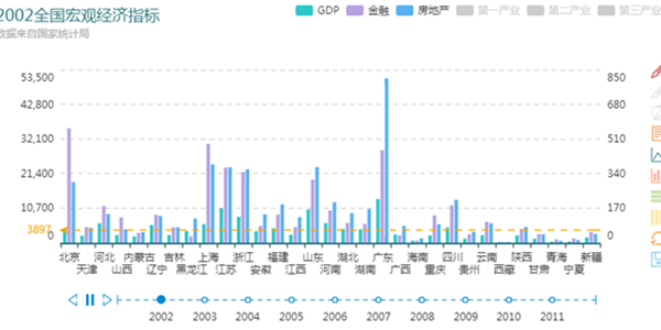
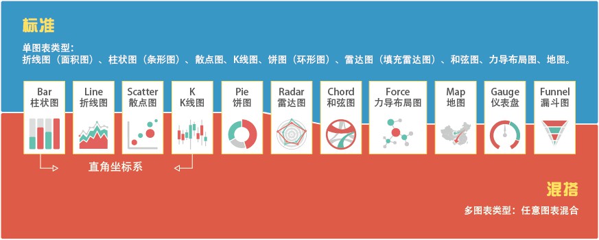
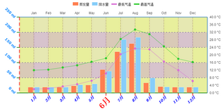
Compared with a single chart, a combination of charts can be more expressive and more interesting. ECharts supports any combination of any chart provided herein (a total of 11 types and 17 subtypes) :
Line (area), column (bar), scatter (bubble), candlestick,
Pie (doughnut), radar, map, chord, gauge, funnel, force-directed chart.
A standard combination chart contains a legend, toolbox, data area zoom, scale roaming module, a Cartesian coordinate system (which may have one or two category/value axis/axes).
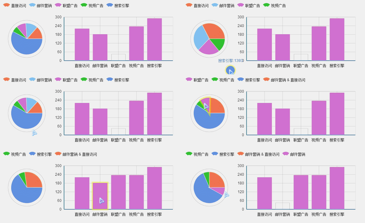
Drag-Recalculate
Our "Drag-Recalculate" feature (patented) brings you the best user experience ever: by allowing you to effectively extract, integrate, or even exchange data among multiple charts, ECharts open you up every opportunity for data mining and integration.
Data View
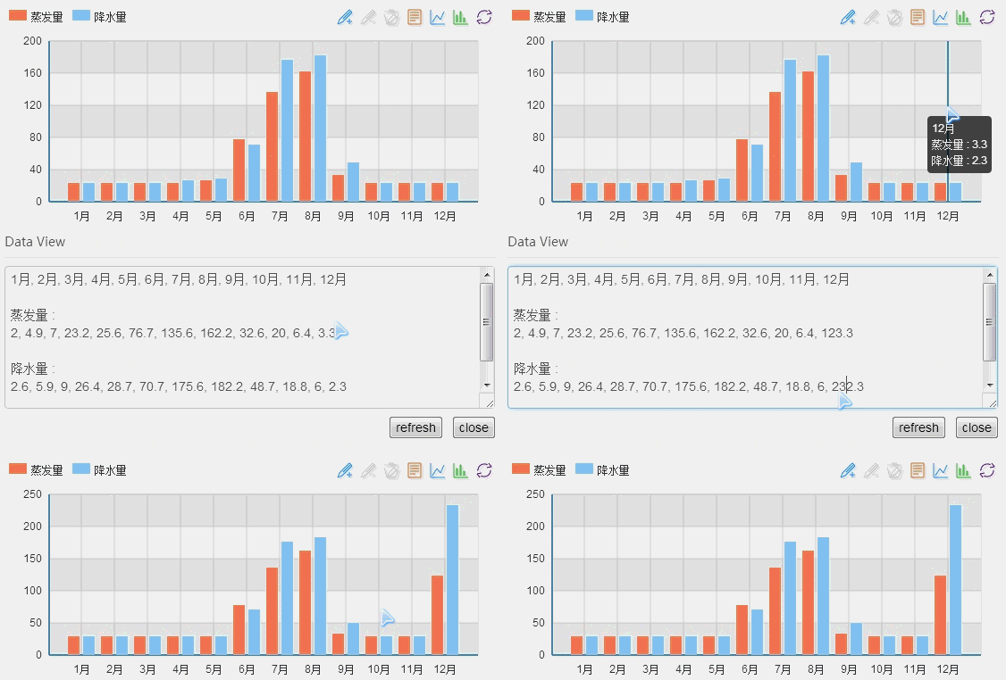
If the data means a lot to you, simply viewing the visualized data will no longer be satisfying, and you'll start to wish that you can download, save, share, or even process and integrate the original data.
Now, it ceased to be a dream as we give you a comma-delimited data text, which is our Data View. Of course, you can always reload the output method of Data View to present your data your way.
Moreover, via Data View you the wise can even edit your data and update the chart, which, compared with Drag-Recalculate, is batch operation!
Magic Switch
All charts present data. However, it's hard to tell which one is best since the performance depends on so many things: data itself, user's need, personal preference, etc. For example, it's always a big headache to choose between bar and line, stack and tile.
With our Magic Switch, you can switch your chart effortlessly! Try to switch from bar to line, stack to tile, and you may well understand what suits you best.

Legend Switch
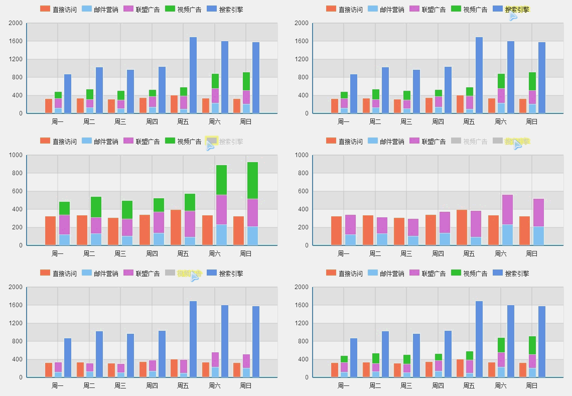
Multi-series of data show you multiple things, but how to focus on the single series that matters?
With our Legend Switch, you can turn off other series and focus on the series you are interested in with just a click.
Area Zoom
Data can be infinite, but the display space is always limited. So you need Area Zoom to help you zoom in on a selected data area that you care about.
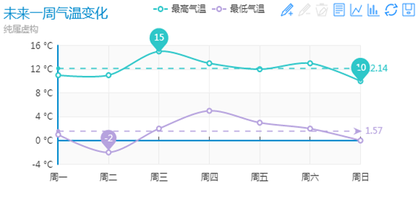
Powered by great capability of data analysis, the Extreme MarkPoint and the Average MarkLine are always moving in lockstep. Try this 》
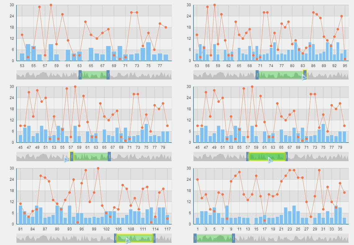
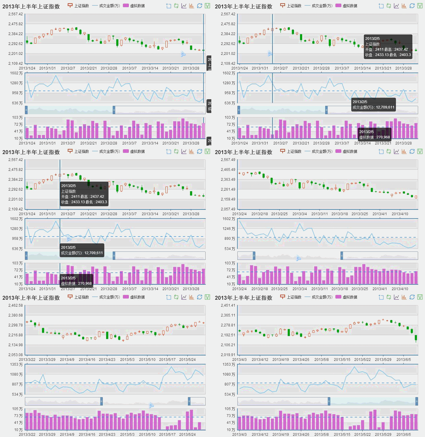
Chart Linkage
You've got multiple series of data to plot. They're associated and inseparable. But if you put them into one chart, it would be a mess sometimes. What could you do?
With the Chart Linkage of ECharts, multiple charts can be easily linked up. And it's not just about displaying informative tooltips when hovered over; it's about sharing components and events, and stitching together automatically when saved as image. Try this 》
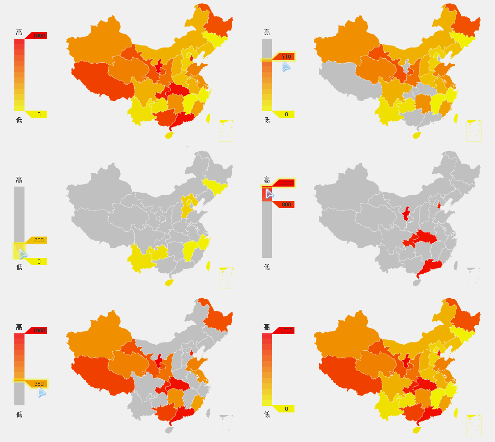
Scale Roaming
The colors in a Cartesian chart (like map or scatter) will help you to classify data at first glance.
But how to focus on data that matters after the initial analysis? With our Scale Roaming, you can turn off other scales and focus on the scale you are interested in with just a click.
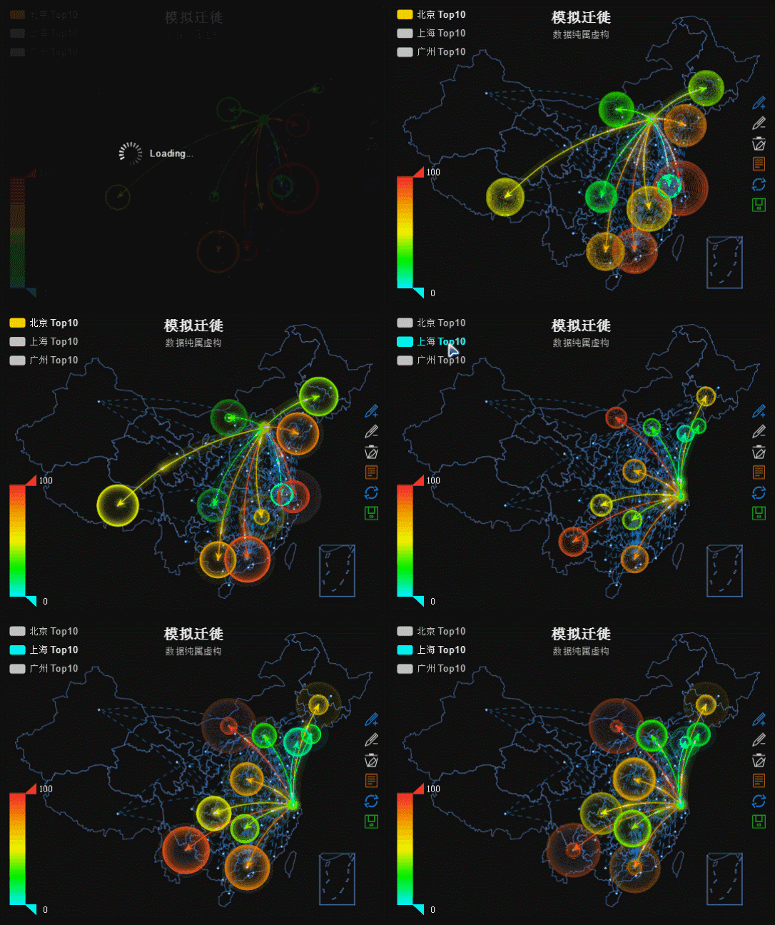
Glow Effect
We know that sometimes you gotta catch the eye.
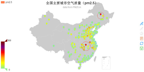
ECharts allow you to add a glow effect to the MarkPoints and MarkLines of your charts or maps in the twinkling of an eye. Here is an example of how twinkling it can be: simulation of Baidu migration.
Big Data Mode
Got tens of millions of data to present? And once again professional statistical tools (e.g. MATLAB) seems like the only option left?
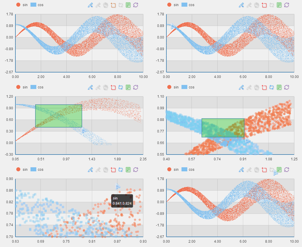
Nope, not anymore! Despite rich interactivity, ECharts can still plot up to 200,000 data points on a Cartesian chart (line, column, scatter, and candlestick) in the blink of an eye. For conventional applications, modern browsers would be all you need to show a million data points.

Data Streaming
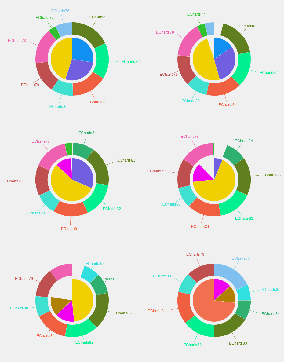
If you need to display up-to-second data, data streaming charts really hit the spot, for they will automatically update themselves every 'n' seconds by getting new data from the server.
Auxiliary Line
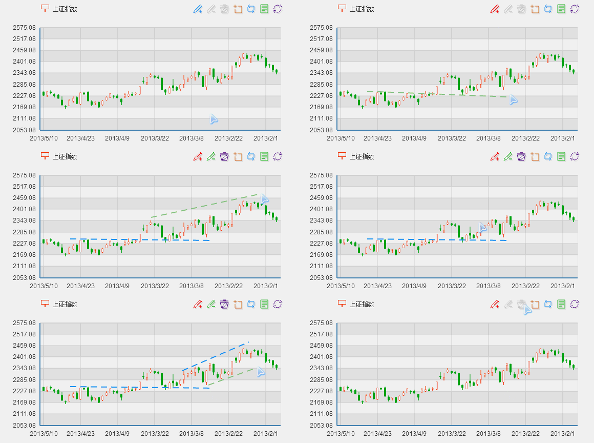
Trend line, average line, ascending trend channel, support… of course you know how to use them.
ECharts allow you to add auxiliary lines not only on candlestick – which is a must – but also on every single chart type we support.
Multi-Series Stacking
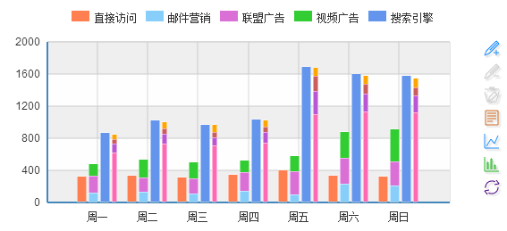
ECharts is much smarter than you thought: with our auto-scaling graph entities and Cartesian coordinate system, you can stack multiple series of data any way you want.
Sub-Region Mode
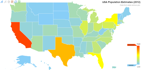
In ECharts, we support World Map, China Map, Map of China Provinces & Cities. We also support sub-region mode, which develops sub-region maps from the main map types. In fact, ECharts can easily output the sketch maps of 176 countries and regions worldwide as well as over 600 cities nationwide. Try this 》

GeoJson Map Extension
By compressing the standard GeoJson geographic data with efficient compression algorithm, we get the map data (only about 30% the size of the original standard geoJson data) to drive our built-in maps. If the built-in map data or types do not meet your project needs, you can always produce a new type yourself through simple dynamic registration. Try this 》
MarkPoint & MarkLine
We are fully aware of the need for adding extra markPoints and markLines: we know you want to mark certain positions on map, extreme points on line and trend line on column...And that's why we make our markPoints and markLines applicable to all the chart types in ECharts library, and more than that: markPoints and markLines in ECharts boast interactive features responsive to components like Legend Switch and Scale Roaming, etc.
High Customizability
With over 600 configuration options and the design of multi-level control at hand, you are free to make your chart your way.
Documentation »Event Interaction
We can capture user interaction and data change events to link chart to each other or the outside world. try this »
Event debugging Try this »
